Saturday, August 23, 2014

Canvas Collage Ideas: Green and Gold Collage on Canvas


 These past few weeks I've been creating assemblages and collages. Here is one of my latest endeavors, done on a 11 x 14 inch canvas panel.  My inspiration was the white flowers with their rich brown centers and the chartreuse leaves.


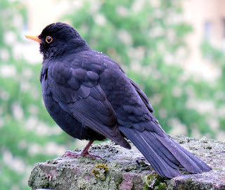
To create the bird, I used this image found on Pixabay.


I opened it in Gimp, and cut it out with the Free Select Tool. I recolored it with green and gold using the colorize tool in Gimp. Here is the result:


I also tried another method. I used the desaturate tool to make the bird lighter. I printed it out, trimmed around it with scissors and painted the feathers with green, yellow and gold acrylic paint. I thought this one looked better in my collage so this is the one I chose. The branch (painted gold) and leaves came from my yard.


The butterfly also came from Pixabay.  I opened it up in Gimp, recolored it and added some dots.
Then I printed and trimmed around it with scissors and added some gold acrylic paint.


I needed something to fill in the space above and below the butterfly. I created a swirl design and printed 2 of them onto some tracing paper and painted them gold. After the paint dried,   I wet along the edges so they'd tear out easily.

To add visual interest, I glued some gold-painted screening material in 3 of the corners.  The wooden tag in the right lower corner has the words, "God has a good plan for my life." It adds a nice touch and reinforces the main idea in the Bible verse.  

Friday, December 27, 2013

How to Make Personalized Stationery: Homemade Gift Idea

I've been thinking about how neat it would be to create my own personalized stationery for those rare times when I actually sit down and write a letter. Then I started thinking about giving it away as a gift or maybe even selling it at some point in the future- now that would be exciting!

My mom had a birthday this month and since she writes a lot of letters, I decided to test the waters on her.

I thought about some of the things she likes (flowers, birds etc.) and her favorite colors and with the help of Gimp and Scribus and a photo of a rose I took one summer,  I created my personalized stationery.

I created a curvy line in inkscape and brought it into Gimp. After finishing my design in Gimp, I saved it as a PNG and then imported it into Scribus to add the text.  In Scribus placed 2 designs on one regular page (landscape).

I saved the design as a PDF and printed off 6 sheets, and cut them in half with my Guillotine Paper Trimmer.        


Next I created a coordinating design to put on the envelopes- her return address and one rose.

I don't have a good way to package them yet ... suggestions, anyone? I will probably have to wrap it with clear cello wrap, putting a piece of card stock under the stationery to keep it from bending.

I'll add a book of stamps, a nice pen and my gift will be complete. 


Thursday, November 28, 2013

Graphic Art Success: Choosing to Be Excellent

Last week I wrote a post about using public domain images using an owl image. I created several different images and had them published on hundreds of products in my Zazzle and Cafepress stores. A few days later, I discovered some problems with the pink owl.

Evidently when I used the scaling tool to widen the body, it left a gap between the body and head that I had not dealt with and I also had some jagged edges on the head as seen here.

Why I didn't notice it before I created all those products, I don't know. I musta just gotten careless.

Now I had a choice to make. Do I just leave it (since it's not all that obvious) or do I correct my mistake and start over? One of the things I think about when I lay down at night- will the people who buy my products see excellence or will they find mistakes I've missed (double shudder :).

Anyway, after thinking about the situation, I quickly deleted all the products that had the owl images on them. I fixed the original owl images and restarted the process.

Was this a lot of work? Yes! But I would do it again. This has taught me an important lesson, and that is to enlarge my images to 100% and carefully scan for anything that needs to be fixed before publishing them.  It also made me think about excellence. Do I just want to create work that's good  enough or do I want to present my best work?

This truth can be applied to any area of my career. If I've volunteered to create a graphic or logo for my church or other nonprofit organization, do I create sub par work because it's free? 


Monday, November 25, 2013

Using Public Domain Images: Cute Owl Images

I have not sold many things on Zazzle or Cafepress (mostly because I have not been marketing them very much.) But I did make a few sales which has inspired me to give it more of my effort and attention. It seems like my "cute images" do the best.  For example this mother and baby parrot that are on many of the products in my Cafepress Store and also in my Zazzle Store.

(I wrote a post about this image, My First Attempt at Using Public Domain Images earlier this year.)

Since cute seems to sell, I decided to create some more cuteness.  Drawing animals is not one of my strongest qualities so I I found this wonderful owl by moonlight at http://www.publicdomainpictures.net


In Gimp, I used the free select tool (feather edges set to about 6) to cut out the owl. I duplicated the owl 2 times and used the colorize tool to color mom pink and baby blue. I used the scale tool to make baby owl smaller and add some girth to the mother owl.

I also changed baby owl's nose, to make it more "button-like."

I used the round paint brush, and changed the eyes to make it seem as if the owls were looking at each other.

I created a few of my own stars.

I created the appearance of mother owl extending her wing protectively around baby.

I also shortened and thickened the branch and placed it at a more horizontal direction. I put a courtesy to Public Domain Pictures on tree trunk.  

I ended up with this image of a cute owl family. 

After brainstorming a while, I came up with 2 more versions, using just the mother and baby owl. I thought it would be a great image to put on gifts for mothers to their children or a grandparent to give to a grandchild.


I welcome comments. Please share your own tips and thoughts with the rest of us. 


Wednesday, November 6, 2013

Public Domain Images: 7 Benefits of Giving Away My Artwork

This morning I was thinking about some of the benefits I've received as a result of putting a few of my images in the public domain (free for any use- including personal and commercial use). I have a few of my images on Pixabay as well as on a free blog.  Here are some of the benefits I've seen.

1. It's a good way to get practice. I enjoy the process of creating without the pressure of stringent guidelines.

2. It feels good to give back. I use other people's artwork and designs for free so I feel good about giving away some of my work.

3. It's one way to use quality images that haven't sold. I have a lot of images on microstock photography sites that haven't sold and are just sitting there taking up space.

4. It encourages me to keep creating when I see how many times my images are downloaded and see where people are using them.  Sometimes people will send you a link and let you know where they are using your designs, but if not, you might find some of them with Google's search by image tool. (Click on the camera icon). 

5. It's a way to generate income. I put Adsense on my free blog. Another way to make money is through donations. Places like Pixabay make it easy for artists and photographers to be able to receive contributions.  

7. It offers exposure for me and my artwork. I try to make it a point to only offer high quality images  even if it is free because you just don't know what doors may open as a result.


Monday, November 4, 2013

Use of Public Domain Images, Part Two


Awhile back I wrote a post on how I used an image from a public domain site and created a new image using Gimp. Today I'll show another example and hopefully inspire you to come up with your own creations. 

I found this cute little penguin at Pixabay.


I duplicated him, elongated the body, made the wings point downward, changed his eyes and straightened out the beak. I played around till I came up with my version of the little penguin's dad. (Don't laugh- I was having fun :)


Then I found some other clip art elements, a fishing pole and fish, from clkr.com. They 
needed a few tweaks to make them work.


Last I added some hats, a background and a credit line and there you have it- isn't that fun?


I put the design on Zazzle and Cafepress to see if it would generate any responses.

Friday, November 1, 2013

How to Prepare Your Files For Print with Gimp and Scribus


This past year I learned quite a bit about printing.  It started when I took some png files into our local print shop and was quite surprised that they wouldn't print them because they said the text would be pixalated.

Now, granted,  I did not have any experience with printing but I did know that most of the print-on demand websites that I work with use png or jpg files.

I asked a few questions and then I did a lot of research on the Internet. After some experimenting, I came up with a system to make sure my (image and text) files are in the right format before I take them to a printer. 

1. First I create a new file in Gimp. (This step is eliminated if I'm just working with text).  I make sure the dpi is set at 300 (from menu > image> print size). I also make sure the size is correct (I don't want it to be too small for the finished project.)

I then go ahead and create my artwork in Gimp. When I'm done, I export it as a tiff, png or jpg file.

2. I open up Scribus and create a file in the size I want my finished project to be. Next, I import the image I created in Gimp. Then I add my text.  When I'm happy with the way it looks, I export it as a  PDF file.  I embed the fonts and choose color output intended for printer and my file is good to go.