Friday, December 27, 2013

How to Make Personalized Stationery: Homemade Gift Idea

I've been thinking about how neat it would be to create my own personalized stationery for those rare times when I actually sit down and write a letter. Then I started thinking about giving it away as a gift or maybe even selling it at some point in the future- now that would be exciting!

My mom had a birthday this month and since she writes a lot of letters, I decided to test the waters on her.

I thought about some of the things she likes (flowers, birds etc.) and her favorite colors and with the help of Gimp and Scribus and a photo of a rose I took one summer,  I created my personalized stationery.

I created a curvy line in inkscape and brought it into Gimp. After finishing my design in Gimp, I saved it as a PNG and then imported it into Scribus to add the text.  In Scribus placed 2 designs on one regular page (landscape).

I saved the design as a PDF and printed off 6 sheets, and cut them in half with my Guillotine Paper Trimmer.        


Next I created a coordinating design to put on the envelopes- her return address and one rose.

I don't have a good way to package them yet ... suggestions, anyone? I will probably have to wrap it with clear cello wrap, putting a piece of card stock under the stationery to keep it from bending.

I'll add a book of stamps, a nice pen and my gift will be complete. 


Thursday, November 28, 2013

Graphic Art Success: Choosing to Be Excellent

Last week I wrote a post about using public domain images using an owl image. I created several different images and had them published on hundreds of products in my Zazzle and Cafepress stores. A few days later, I discovered some problems with the pink owl.

Evidently when I used the scaling tool to widen the body, it left a gap between the body and head that I had not dealt with and I also had some jagged edges on the head as seen here.

Why I didn't notice it before I created all those products, I don't know. I musta just gotten careless.

Now I had a choice to make. Do I just leave it (since it's not all that obvious) or do I correct my mistake and start over? One of the things I think about when I lay down at night- will the people who buy my products see excellence or will they find mistakes I've missed (double shudder :).

Anyway, after thinking about the situation, I quickly deleted all the products that had the owl images on them. I fixed the original owl images and restarted the process.

Was this a lot of work? Yes! But I would do it again. This has taught me an important lesson, and that is to enlarge my images to 100% and carefully scan for anything that needs to be fixed before publishing them.  It also made me think about excellence. Do I just want to create work that's good  enough or do I want to present my best work?

This truth can be applied to any area of my career. If I've volunteered to create a graphic or logo for my church or other nonprofit organization, do I create sub par work because it's free? 


Monday, November 25, 2013

Using Public Domain Images: Cute Owl Images

I have not sold many things on Zazzle or Cafepress (mostly because I have not been marketing them very much.) But I did make a few sales which has inspired me to give it more of my effort and attention. It seems like my "cute images" do the best.  For example this mother and baby parrot that are on many of the products in my Cafepress Store and also in my Zazzle Store.

(I wrote a post about this image, My First Attempt at Using Public Domain Images earlier this year.)

Since cute seems to sell, I decided to create some more cuteness.  Drawing animals is not one of my strongest qualities so I I found this wonderful owl by moonlight at http://www.publicdomainpictures.net


In Gimp, I used the free select tool (feather edges set to about 6) to cut out the owl. I duplicated the owl 2 times and used the colorize tool to color mom pink and baby blue. I used the scale tool to make baby owl smaller and add some girth to the mother owl.

I also changed baby owl's nose, to make it more "button-like."

I used the round paint brush, and changed the eyes to make it seem as if the owls were looking at each other.

I created a few of my own stars.

I created the appearance of mother owl extending her wing protectively around baby.

I also shortened and thickened the branch and placed it at a more horizontal direction. I put a courtesy to Public Domain Pictures on tree trunk.  

I ended up with this image of a cute owl family. 

After brainstorming a while, I came up with 2 more versions, using just the mother and baby owl. I thought it would be a great image to put on gifts for mothers to their children or a grandparent to give to a grandchild.


I welcome comments. Please share your own tips and thoughts with the rest of us. 


Wednesday, November 6, 2013

Public Domain Images: 7 Benefits of Giving Away My Artwork

This morning I was thinking about some of the benefits I've received as a result of putting a few of my images in the public domain (free for any use- including personal and commercial use). I have a few of my images on Pixabay as well as on a free blog.  Here are some of the benefits I've seen.

1. It's a good way to get practice. I enjoy the process of creating without the pressure of stringent guidelines.

2. It feels good to give back. I use other people's artwork and designs for free so I feel good about giving away some of my work.

3. It's one way to use quality images that haven't sold. I have a lot of images on microstock photography sites that haven't sold and are just sitting there taking up space.

4. It encourages me to keep creating when I see how many times my images are downloaded and see where people are using them.  Sometimes people will send you a link and let you know where they are using your designs, but if not, you might find some of them with Google's search by image tool. (Click on the camera icon). 

5. It's a way to generate income. I put Adsense on my free blog. Another way to make money is through donations. Places like Pixabay make it easy for artists and photographers to be able to receive contributions.  

7. It offers exposure for me and my artwork. I try to make it a point to only offer high quality images  even if it is free because you just don't know what doors may open as a result.


Monday, November 4, 2013

Use of Public Domain Images, Part Two


Awhile back I wrote a post on how I used an image from a public domain site and created a new image using Gimp. Today I'll show another example and hopefully inspire you to come up with your own creations. 

I found this cute little penguin at Pixabay.


I duplicated him, elongated the body, made the wings point downward, changed his eyes and straightened out the beak. I played around till I came up with my version of the little penguin's dad. (Don't laugh- I was having fun :)


Then I found some other clip art elements, a fishing pole and fish, from clkr.com. They 
needed a few tweaks to make them work.


Last I added some hats, a background and a credit line and there you have it- isn't that fun?


I put the design on Zazzle and Cafepress to see if it would generate any responses.

Friday, November 1, 2013

How to Prepare Your Files For Print with Gimp and Scribus


This past year I learned quite a bit about printing.  It started when I took some png files into our local print shop and was quite surprised that they wouldn't print them because they said the text would be pixalated.

Now, granted,  I did not have any experience with printing but I did know that most of the print-on demand websites that I work with use png or jpg files.

I asked a few questions and then I did a lot of research on the Internet. After some experimenting, I came up with a system to make sure my (image and text) files are in the right format before I take them to a printer. 

1. First I create a new file in Gimp. (This step is eliminated if I'm just working with text).  I make sure the dpi is set at 300 (from menu > image> print size). I also make sure the size is correct (I don't want it to be too small for the finished project.)

I then go ahead and create my artwork in Gimp. When I'm done, I export it as a tiff, png or jpg file.

2. I open up Scribus and create a file in the size I want my finished project to be. Next, I import the image I created in Gimp. Then I add my text.  When I'm happy with the way it looks, I export it as a  PDF file.  I embed the fonts and choose color output intended for printer and my file is good to go.


Wednesday, October 23, 2013

Sell Your Art: Thinking Outside the Box


    As an artist or photographer trying to sell your art, you've probably found out by now that there are hundreds of thousands of other creatives doing the same thing. Not to mention all the sites offering free images.  What does that mean? To me it means that if I'm going to make it, I had better find the path I'm supposed to be on and also be creative in how I sell my art. 

    If you have a great imagination, the possibilities are endless. One of the ways to use and sell your art is by selling a certain product using your images. Some ideas include refrigerator magnets, t-shirts, embroidered towels or baby clothes, furniture you've decorated with your art. 

    My father-in-law loves to do this sort of thing. I think he's painted, stenciled, decorated, glued gems on everything in the house that sits still long enough. So far, my mother-in-law and the dog have not been decorated- I think it's cause they keep moving. :) 

    I keep telling him he should have a store where he could sell his creations, because eventually he always runs out of things in the house to decorate. 

    Of course there is a lot more to it than this. Your art has to appeal to your niche audience, you need a quality product and a good marketing strategy.  However, if you are looking for more ways to generate income from your art, hopefully this post will get you started brainstorming.

      Wednesday, October 16, 2013

      Gimp Tips and Tricks: Giving Art a New Life


      In my early days of playing with Gimp and trying out the various filters, I created an image using ruby fonts outlined with silver metal. I love to use scripture in my art so I this one showcases  Proverbs 31:   Here is my original art:


      Yeah, I know- it's pretty bad. I was happy with the font effect but not pleased at all with the background. This week I decided to revise it.  I thought maybe adding an image would help, so I found this over at Pixabay.


      I elongated the right end of the image with the scale tool, desaturated the image and overlaid it with a black and white radial gradient.  Here is the result:

      Virtuous Woman Verse in Ruby Font, Silhouette of Woman on Right Side


      It's not perfect but I think it looks quite a bit better than my original creation.

      All these images are free for the taking by the way.    

      Wednesday, September 25, 2013

      Fine Art America: My First Art Uploads

       
      There are so many opportunities for artists on the internet- it actually could get rather confusing. I joined Fine Art America in June of this year but hadn't done much with it since I didn't consider myself to be an artist (at least not in the traditional sense of the word).

      I started looking at some of my photos and considered the possibilities and out of that came my first attempt at "stand alone" art. I used a photo of a rose I took last summer, the Gimp and my Genius MousePen Graphic Tablet and came up with this design:

      
      A set of 3 blue and gold roses on mosaic background


      Tuesday, August 27, 2013

      Gimp Tips: Dealing With Jagged Edges


      One of the first images that I submitted (to various photo submission sites) was this birthday 
      balloon illustration.


      From a distance it looks pretty good and most places accepted it. However a few places wouldn't take it because the edges were pixelated (jagged). I'm not sure how I missed that ... but I did. Here is a close up.


      Now what do I do? I did some research and found a way to kind of fix it. It was actually not that hard since I had the balloons on transparent layers.


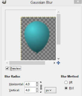
      I simply duplicated the balloon, and added a Gaussian blur (Filters > blur > Gaussian blur > setting of 4) to the bottom layer.


      and merged them together (Select the top balloon layer  > Right click it and choose Merge Down)


      You can see here that it's not smooth but the edges are softer so the problem is less obvious. Thankfully, the file is big enough so I can scale it down and it becomes even less noticeable.


      Tuesday, August 20, 2013

      MagCloud- An Exciting New Discovery for Me

      Lorene Troyer


      I haven't posted for awhile- I thought I'd share about a company, MagCloud, I heard about while watching a Youtube video by Barney Davey.  I'm quite excited about this company because of a  business venture I'm working on. I need an economical way to get my products printed (since I don't want to invest in a commercial printer just yet).

      MagCloud is a content publishing web service. It looks like you can publish your own magazines and digests, flyers, posters etc. The prices seem to be very reasonable. I'm thinking it would probably be a good way for churches and businesses to create economical but professional looking bulletins and other hand-outs.

      I read several reviews, most of them were favorable. One complaint was that the paper for the magazine cover seemed too flimsy. After I get some items printed, I'll let you know what I think.


      Monday, May 6, 2013

      Scripture Art: My First Scripture Art Designs

      What do you get when you combine a love for creating graphic art with a love for the Word of God? Scripture art!

      Joshua 1:8, one of my favorite Bible verses, talks about the benefits of meditating on God's Word. To me, this scripture is the perfect success formula.  After thinking about it and researching the meaning of some of the words, (in order to clarify it for myself), I wrote it like this:

      Keep speaking the Word of God out of your mouth. Meditate on it (study it, imagine it coming to pass in your life and talk about it all the time). Then you will do everything that you meditate on and you will make your way of life (your conversations, your habits, and your manners) to be good and profitable. Then you will have good success.

      I liked it so well, I wanted to be able to hang it on my bedroom wall. I had the thought that if I liked it, maybe others would like it as well.  So I spent some time at the drawing board (aka the Gimp) and came up with these two designs.  


      Joshua 1:8 Scripture on Navy and Lavender Design by Lorene Troyer
      Joshua 1:8 Scripture on Navy and Lavender Design by Lorene Troyer

      I put them for sale at Imagekind to see what kind of response I'd get.

      Monday, April 29, 2013

      Do You Have to Draw to Be a Graphic Designer?

      by Lorene Troyer

      Do you have to be good at drawing to be a graphic designer? It certainly would come in mighty handy at times, if I could draw- but the truth is, I never learned to be real adept at drawing or painting on paper.

      I did teach myself a few things with an art kit my parents got me for Christmas one year, but I never really enjoyed it that much- it was more like a chore than anything else.

      It's kind of hard to do any kind of graphic design without graphics or images. Here are some ways to get around this issue (if you are fairly adept at using programs like Photoshop, Gimp or Illustrator etc).

      *Have a family member or friend draw what you need.

      *Buy art or photos that have a commercial-use license.

      *Get art or photos that are in the public domain or are available for commercial use. 

      *Take your own photos or in my case, I have a photographer friend who told me to let him know what I'd like and he'll shoot it.  I also pay my 11 year old son for any photos he takes that I can use (after editing).   
      *Create digital art using filters or geometric shapes.  

      *Cut out items and shapes from photos (you have the rights to) to place in your design.  

      I keep thinking that one of these days I'll learn how to draw, but so far it has not been absolutely necessary. I'd rather spend my time learning how to use my software more effectively. 

      Anyone else have any thoughts on this matter. Please leave a comment.

      Thursday, February 21, 2013

      Gimp Tips: How to Add A Gold Border to an Image

      Here is an easy way to put a gold border around an image (or photo).

      Open the image. You may want to make a duplicate so you won't be working on the original copy.
      Right click on the layers dialogue and choose alpha to selection.

      Create a new transparent layer.
      Click on the foreground color square and when the color dialog opens, set the HTML notation to: a28826

       
      Make sure the transparent layer is selected. Go to Menu > Select  >  To path >  Edit > Stroke path. Set the line width size to whatever size you want. (I set mine to 20.) Push OK.


      Right click on the top layer in the dialogue box and choose alpha to selection.

      Go to the menu > select> shrink and shrink the selection by one pixel.

      Next grab the blend tool, pick the golden gradient, the shape should be bi-linear. Set the repeat to triangular wave.  With the blend tool, come down across the top part of your image at an angle. You should have something like this:


      When you are happy with the way it looks, go to menu > select > none.

      There you have it- an easy gold border for your pictures


      Friday, January 18, 2013

      Making Money as an Artist: How to Repurpose Your Images

      If your goal is to make money as a photographer or artist, it is good to be able to use your images for a variety of purposes. (Obviously this will not work if you sell exclusive images or photos).

      I usually put a lot of effort into getting an image just right so I am always looking for ways to get more out of my efforts. Here is an example of what I am talking about:


      First I created an image making sure it was at least 3 to 4 MP


      Then I created some cards to submit to Greeting Card Universe


      Next I submitted a design to Dreamstime and Bigstock Photo


      Next I used the quick create tool in Zazzle and made a whole bunch of products to sell in my store. 

      Orange Flower in Vase Planner
      Orange Flower in Vase Planner by Lorenedesigns
      Look at Poppy Planners online at Zazzle.com

      Monday, January 14, 2013

      Gimp Tip: How to Give Text a Shiny Raised Appearance

      Here is a quick, easy way to give text a shiny raised appearance.

      First, type your text. Then right click on the text layer and choose alpha to selection. From the menu, choose select and then shrink. Shrink your selection till about the inner one fourth of the letters are selected.


       Then feather the selection by about 10 px (menu>  select>  feather) Next create another layer and name it "highlight." Fill in your selection with white paint and reduce the opacity to about 57 or whatever looks good.


      Wednesday, January 2, 2013

      How to Sell Your Images Online: Getting Started as a Newbie

      "I want to start selling my images (designs, photos, illustrations etc.) online. How do I get started?"  This is a common question.

      One way is to sell your designs is by submitting them to microstock websites such as Fotolia, Dreamstime, or Bigstock Photo etc.

      If you are just starting out, it may be difficult to get your images accepted.  One reason is that you may not be sure what they are looking for yet or as in my case, you're just not that proficient at creating images that sell.

      The first place I submitted my photos and artwork to was Dreamstime.  I think I submitted over 20 files before they finally accepted one (I don't give up easily :) I don't regret it though because I learned a lot from their comments (even though they were rather vague). 

      But if you are not inclined to take that route, here are some places you could try to start selling your images without the intense review period.

      Redbubble- I have an account but so far have not put up anything for sale with them. One thing I've read is that if you want to sell anything you have to do your own marketing.

      Yaymicro- I cannot recall ever having any of my artwork rejected by them, however sales are minimal. I think a person would really have to market themselves to make any money. Another thing that I don't care for is a new a rule they've implemented-  files have to be at least 6 megapixels. I don't usually create files that big.

      Mostphotos - there is no image review process, instead photos are rated by other contributers

      Stockfuel- All my images were accepted and put on their website but... so far no sales.

      Zazzle- I have only been contributing designs to them for a short while but they seem to be pretty easy-going  and have not rejected anything I've uploaded so far.

      Imagekind- Upload images that are suitable to be framed or printed on canvas.  If you have any photos on Flickr- they can automatically be brought into Imagekind.  No harsh reviewing process required :)

      I hope you found this post helpful. Can you think of any other websites to put in this list? Please leave a comment and let us know.